

Survey

Panorama Student Survey
Download the Panorama Student Survey User Guide and view the full survey for use with students in your classroom, school, and district.
Learn More
AI in Special Education
Discover how Mesquite ISD uses AI to enhance IEP quality, reduce documentation time, and provide personalized student support in special education.
Gather data from your school community with surveys that help you better understand and serve students, parents, teachers, and staff.


Address key issues like school climate and safety, absenteeism, and teacher retention with actionable feedback data.
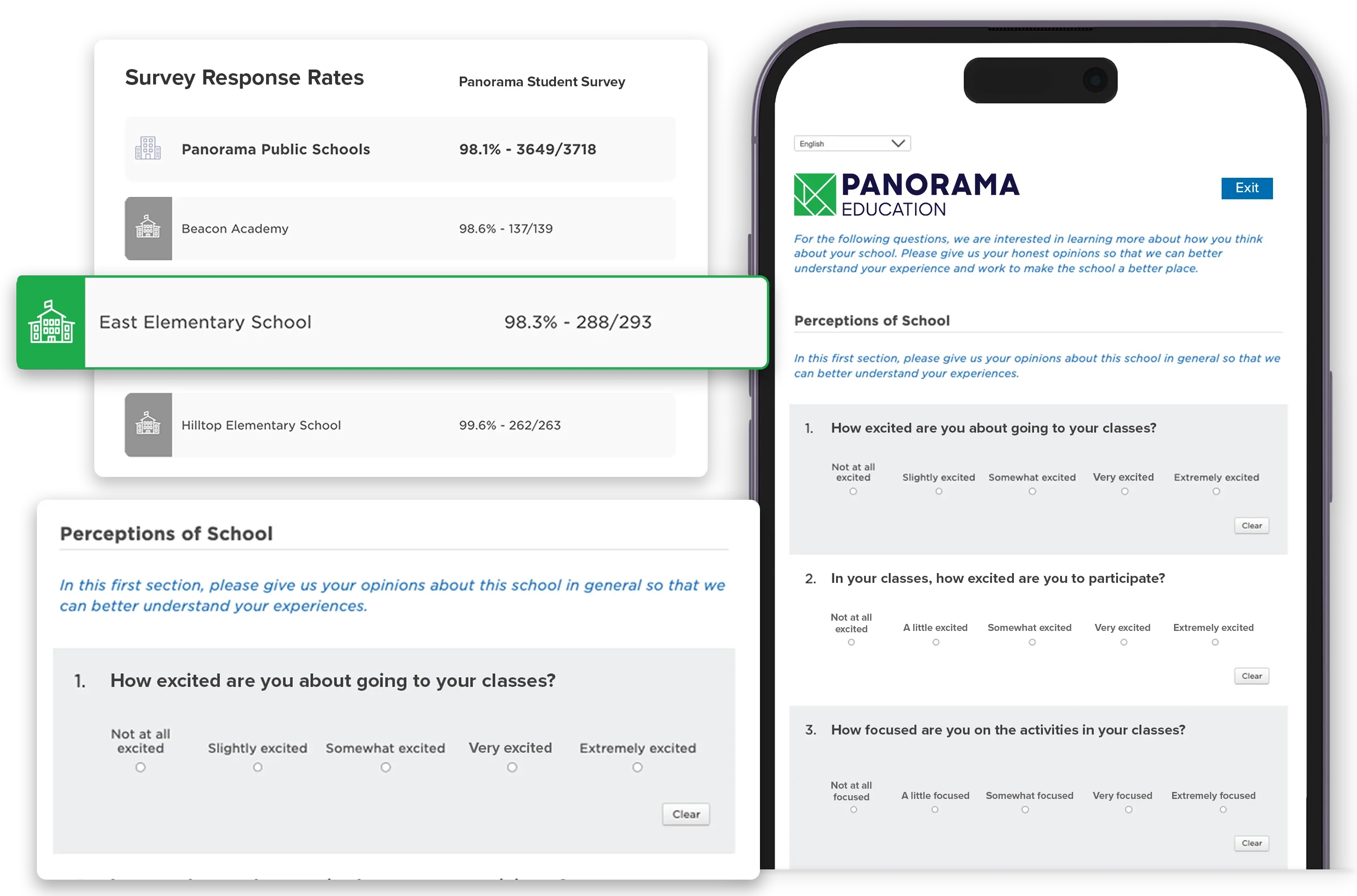
Run district-wide surveys with Panorama’s research-backed, customizable content. Surveys are available in over 30 languages, enabling you to hear from a wide range of students, families, and educators. Plus, Panorama can help you set up surveys and boost response rates, ensuring you get the most value possible from our school survey software.
"Panorama is a valuable tool for us as a district. This survey instrument allows us to elevate student, staff, parent, and community voice on school climate, teaching, learning, relationships, and belonging. The survey information allows us to look at the data as an entire district so that we can provide supports district-wide."
Marcus Wood
Senior Director for Secondary Curriculum, Instruction, and Assessment
Desert Sands Unified School District (CA)
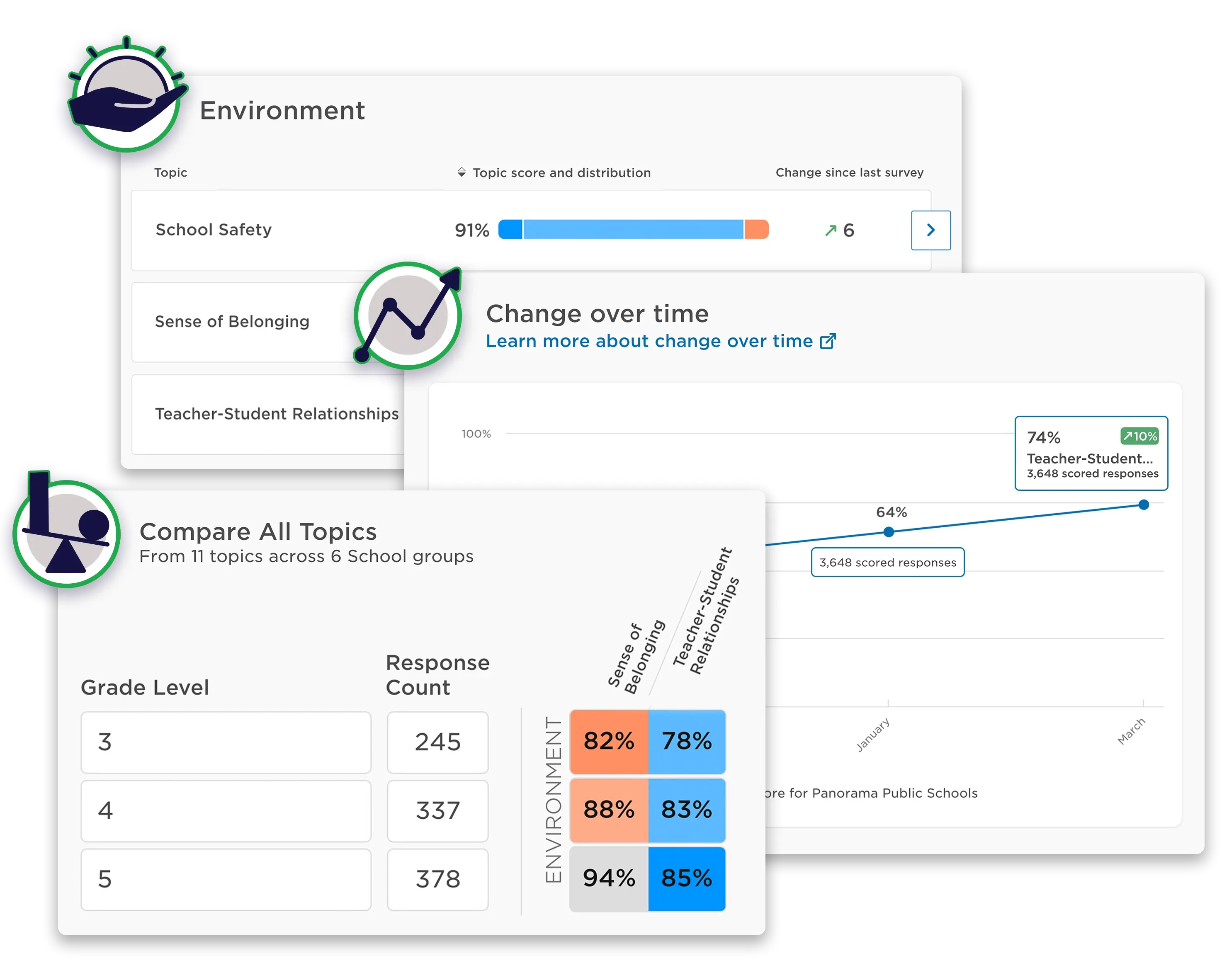
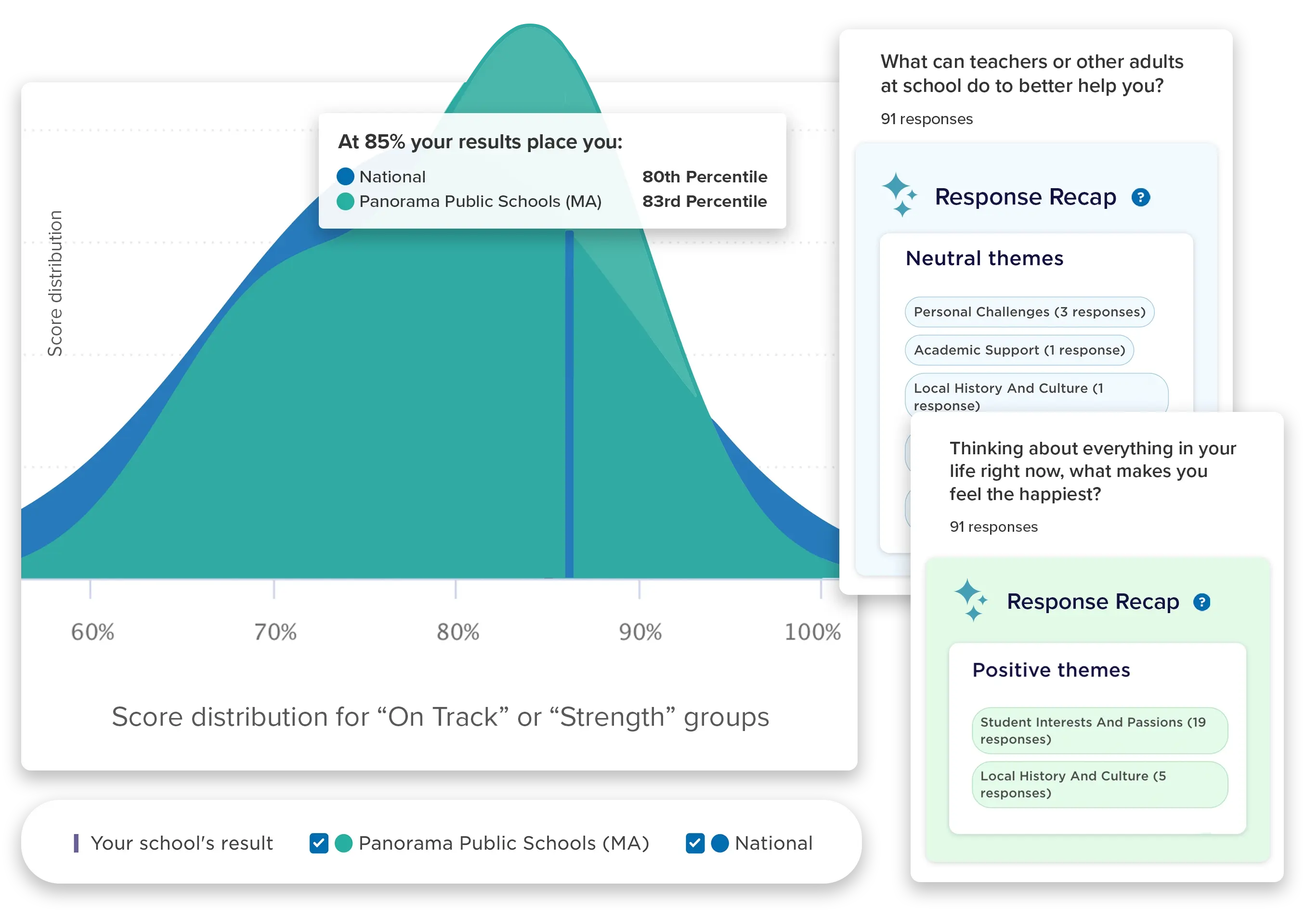
Access comprehensive educational survey reporting tools that provide clear insight into student and system-wide needs. Easily explore survey results and pinpoint strengths and areas for growth using peer benchmarks and extensive demographic filters. Save time with AI-powered features that summarize central themes, identify survey-wide sentiment, and pinpoint any concerning free responses that may require follow-up.
Our national database draws from 2 billion responses to Panorama surveys to derive the scoring system and peer benchmarks, allowing you to see how your community’s responses compare.
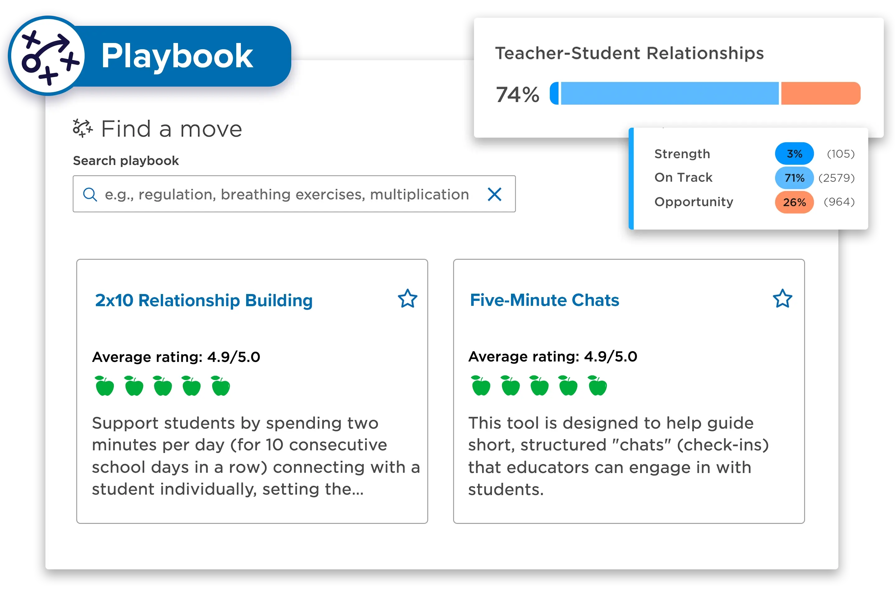
Seamlessly transition from understanding your survey data to taking meaningful action. Gain a complete view of your school community by consolidating feedback from students, staff, and families—including anonymous responses—in a single place. Panorama’s advanced reporting capabilities help leaders optimize resources and actions to create an effective learning environment and improve student outcomes.
Pair Panorama Surveys and Engagement with Strategic Priorities Advisor and Playbook to drive even stronger, more efficient data-driven decision-making.
"With Panorama, we can now measure how students are progressing towards our district's definition of college, career, and/or military readiness, and then collaborate and act on that information to deliver targeted supports and keep every student on the path to developing the skills they need for life success."
Cassandra Gracia
Director of Counseling and College, Career, and Military Services
Schertz-Cibolo-Universal City ISD (TX)
"Panorama has helped us tremendously in analyzing and reporting our climate and culture data. The data that we gather—which we always disaggregate to compare results for different groups of students, staff, and families—is primarily for the purpose of continuous improvement. The data is always meant to be a flashlight, never a hammer."
Dr. Ritu Khanna
Chief of Research, Planning, and Assessment, San Francisco Unified School District (CA)

Take advantage of Panorama’s existing downloadable surveys, which you can use right away to gather valuable feedback from your school community.
Use Panorama’s educational survey software to collect the data you need to enhance student, parent, teacher, and staff experiences.