At Panorama Education, we were founded on a simple but powerful idea: student voice matters. We started this work in 2012 as students ourselves, advocating for the inclusion of student voice in school improvement conversations.
Over the past 10 years, our capabilities and technology platform have expanded—but that same belief of “every student” continues to drive our work forward. Every student matters, every student belongs, and every student deserves an excellent education.
We’ve been lucky enough to see that idea come to life in our work with over 2,000 school districts serving 15 million students across the country. Ten years strong, we’re as committed as ever to our mission of improving education for every student.
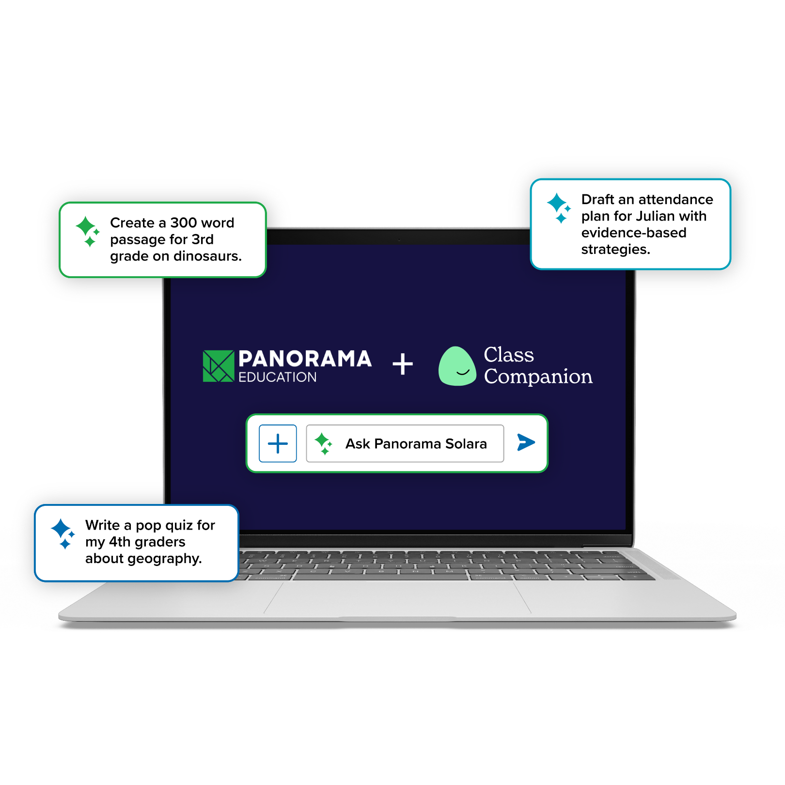
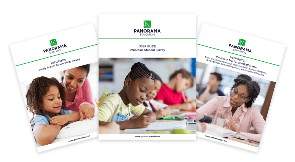
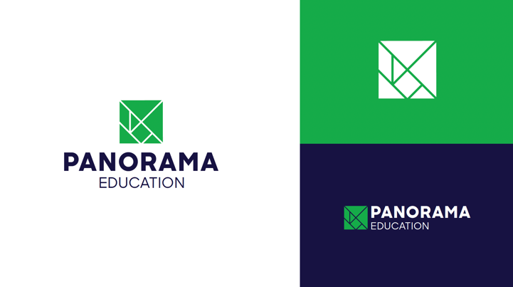
Today, we introduce our fresh new visual identity. Our new logo and colors work together to better communicate Panorama’s mission and vision, and commitment to driving student impact.
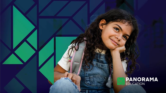
Human, bright, and dynamic—the new visuals capture where we are now and where we're going as a company. They also reflect the firsthand perspectives of school and district leaders on what partnering with Panorama means to them.
We’re excited to share our evolved look and feel, and to invite you into the conceptual thinking behind it.
A Panoramic View of Every Student
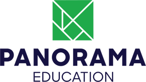 The new Panorama Education logo is inspired by a tangram, a puzzle with multi-angled shapes coming together to form something larger than the sum of its parts. The shapes of the tangram represent a comprehensive picture of students.
It signifies the holistic approach to education that we, and our school and district partners, advocate for—in which well-being is supported alongside academics, every student has trusting relationships with caring adults, and every student develops a sense of purpose and identity.
It’s a nod to our vision that “every student thrives in school, every student benefits from an excellent education, and every student graduates prepared with the knowledge, skills, and mindsets they need to thrive in the modern, ever-changing world.”
Our mark is dynamic and can be reconfigured into many shapes to tell different stories, just as the Panorama platform makes it possible for educators and administrators to understand the full story for every student. Our strong type treatment and accessible color palette bring a refined, tech-forward edge.
Improved Visual Accessibility
We’re committed to ensuring that our resources and products meet the needs of all educators, students, and people engaging with our materials. Our team has significantly improved the accessibility of the Panorama platform over the last few years, including updating color contrast ratios in reporting dashboards and making our product more accessible to screen readers.
We set out to build on this important work when developing our new visual identity. We selected our updated logo and color palette with attention to guidelines and best practices in color accessibility for text and graphics.
For example, our new green and navy blue primary colors are still vibrant, but the shades contain stronger, deeper tones. This helps us pass or exceed color contrast ratio recommendations per Web Content Accessibility Guidelines (WCAG) in everything from professional learning slides to our product navigation.
Product Updates and Our New Visual Identity
Starting on August 24, 2022 and in the coming months, you'll see these logo and color changes come to life in Panorama’s materials, resources, and products.
We’re also excited to announce several product updates that will go live hand-in-hand with our new visual identity:
- A refreshed global navigation will provide a consistent, responsive, accessible, and easy-to-use navigation experience across all of our products.
- Our new logo and color scheme will appear throughout our platform over the coming months to reflect our bold new visual identity.
- Significant enhancements to Playbook will mean improved usability and over 200 new academic, behavior, and life skills strategies.
And this is just the beginning. As we embark on the new school year, we're renewing our commitment to centering our product offerings and enhancements around student success, just as we've done for over 10 years. Keep in touch to learn more about Panorama's product developments supporting behavior, academics, life skills, and MTSS.
Panorama Brand Resource Kit for Schools, Districts, and Partners
Our evolved visual identity reflects our mission and growing capabilities as a company. It also reflects the strength of the schools, districts, and organizations who share in our mission and vision. Our journey includes you!
We know many of our partners use our logo in materials, so we invite you to access the Panorama brand kit to download and use the new Panorama Education logo. We look forward to continuing this journey with you.
.png)
